Navient logo on a white circular background

Developing brand guidelines and visual brand assets in each stage of the brand evolution.

The Navient brand

Navient was created in 2014 when Sallie Mae split into two companies: Navient and Sallie Mae. Navient took over servicing most of Sallie Mae’s private student loans and its contract with the U.S. Department of Education for managing federal student loan payments. The Navient brand and visual identity, including the logo and brand guidelines, were developed by the Lippincott branding agency.

ORIGINAL STATE OF BRAND • 2014 - 2016

Brand elements

Navient brand guide featuring logo, color palette, imagery, tone of voice, typography, logo supergraphic, and secondary graphics.

Brand guidelines

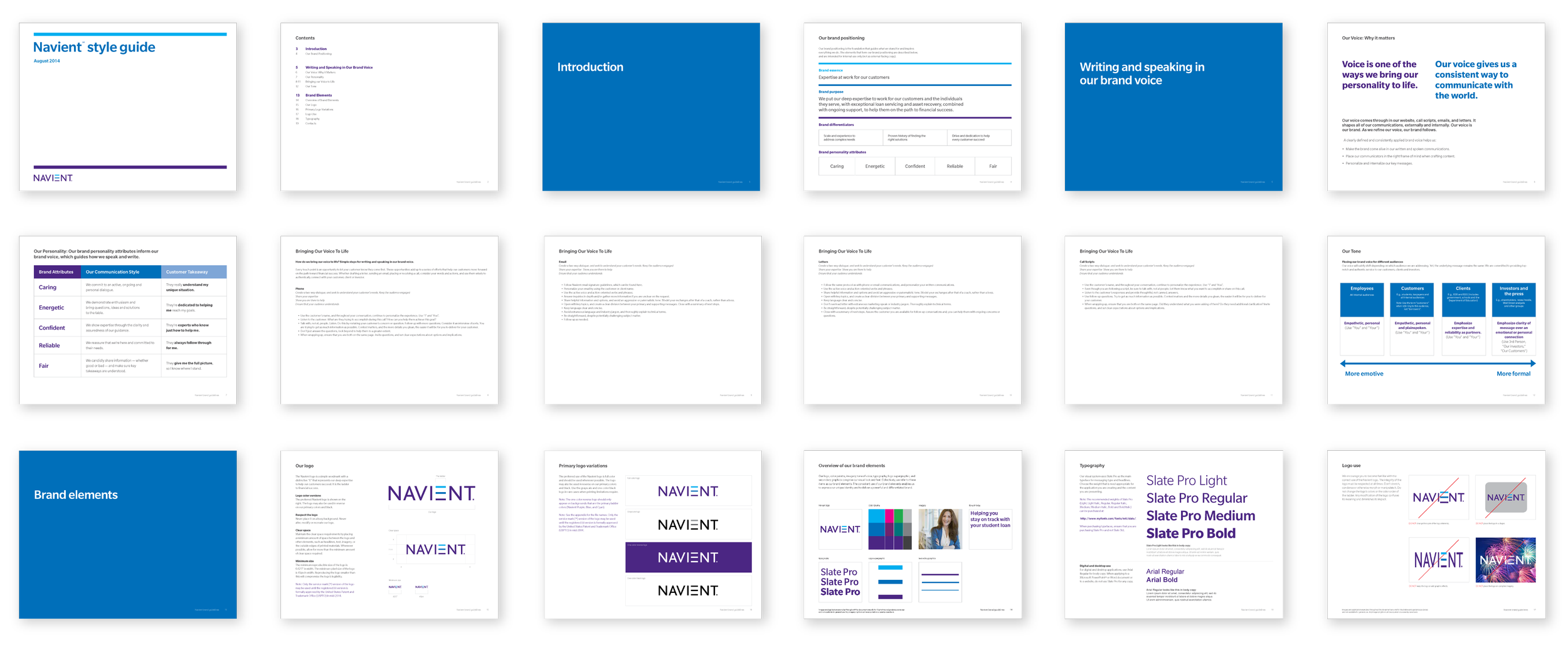
Navient style guide document pages showcasing brand guidelines. Includes sections on brand voice, communication style, logo usage, typography, and brand elements. Features colors, text styles, and diagrams illustrating branding principles.

Brand collateral

Laptop displaying Navient website with sections for borrower communications, preventing delinquency, newsletters, and support resources. Includes login portal and information on financial literacy and reducing loan delinquency.
Cover page of a report titled 'Money Under 35' by Navient, depicting a young woman smiling, wearing a dark blazer and a light blouse. The report focuses on the financial health of young adults aged 22 to 35, conducted by Ipsos Public Affairs.
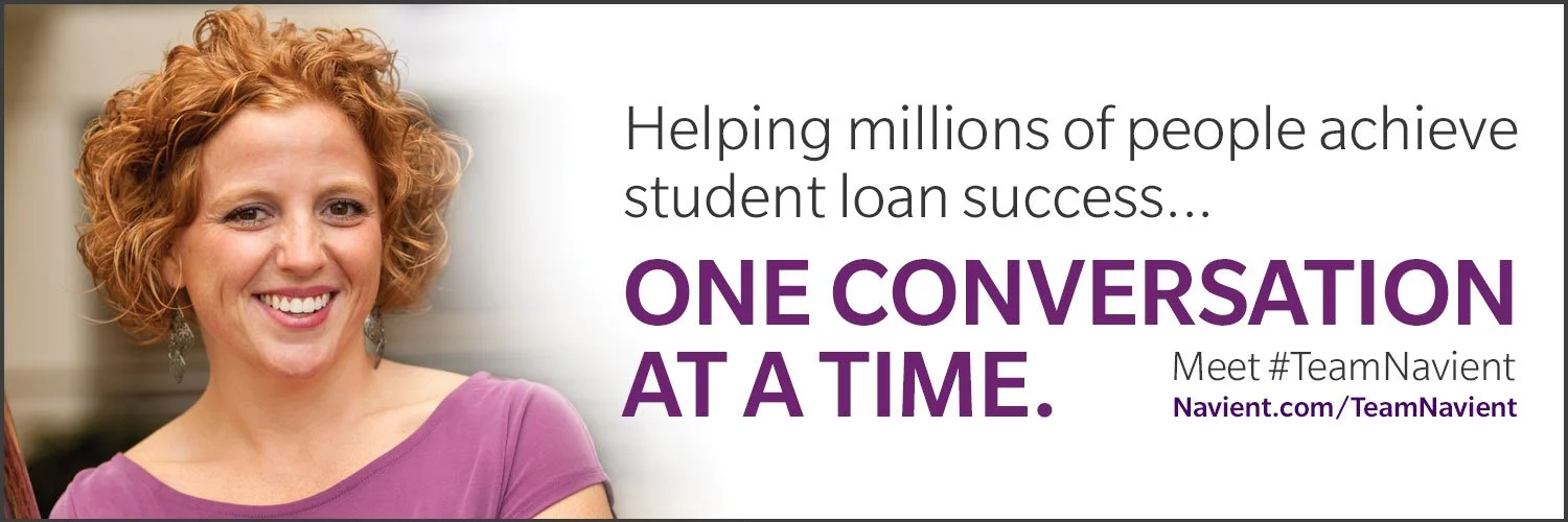
A graphic of a web banner ad with a smiling woman with curly hair, promoting Navient's student loan assistance. Text: 'Helping millions of people achieve student loan success... One conversation at a time. Meet #TeamNavient.'

Before joining the Marketing and Creative Services team, the Navient brand mark and a brief set of brand guidelines were in place at launch.

The original set of visual brand assets consisted of brand mark, cool-toned color palette, a modern sans-serif typeface - Slate Pro, and minimalist set of graphic elements.

These elements combined with photography - typically consisting of one figure isolated from a shaded white overlay background - made for a clean, minimalist look. But the execution, in practice, felt too conservative, posed and sterile.

In subsequent years I was given the agency and opportunity by marketing leadership to evolve brand elements and aesthetics in our designs and provide a more dynamic genuine, more humanized, warm and friendly visual brand aesthetic.

ENHANCED STATE OF BRAND • 2016 - 2018

Brand identity elements including Navient logo, typography styles (Slate Pro and Egyptian Slate Pro), a color palette, an image of a smiling person, a logo supergraphic, and a mosaic graphic.

Brand elements

Brand guidelines

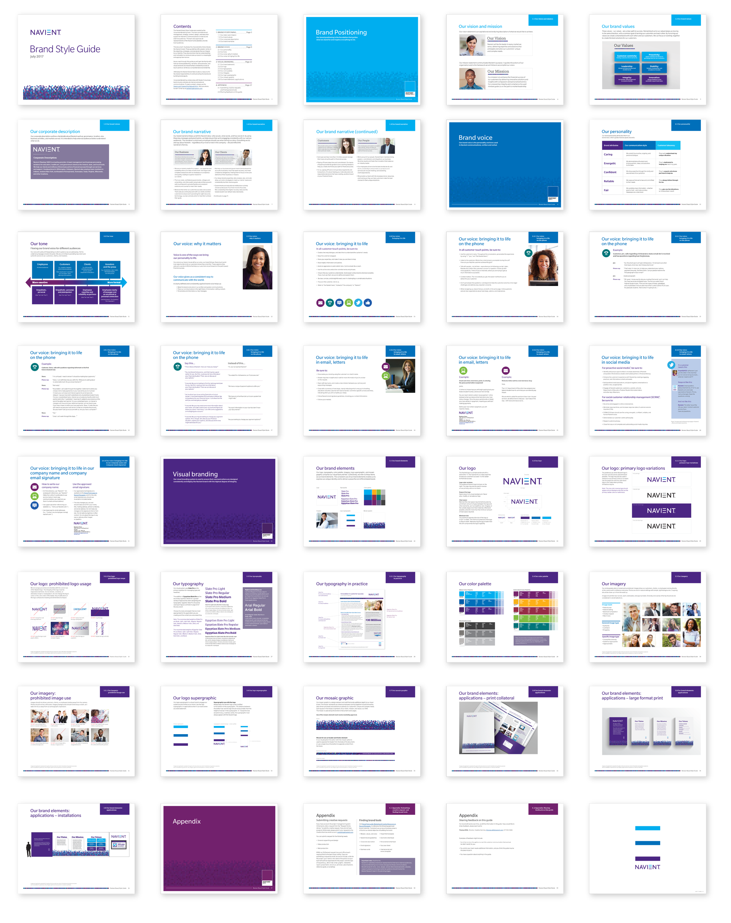
Brand style guide with various slides on brand positioning, corporate description, tone, voice, visual branding, typography, logo usage, color palette, imagery, and visual elements. Includes example layouts, logo variations, and an appendix section.

Brand collateral

Brochure and folder showcasing corporate branding, with information about loan management and services, including images for a 'Career Playbook' series.
A web banner promoting an Employee Stock Purchase Plan. The banner displays information for enrollment with dates July 7-21 and a 'Learn more' button, featuring a mosaic pattern at the bottom.
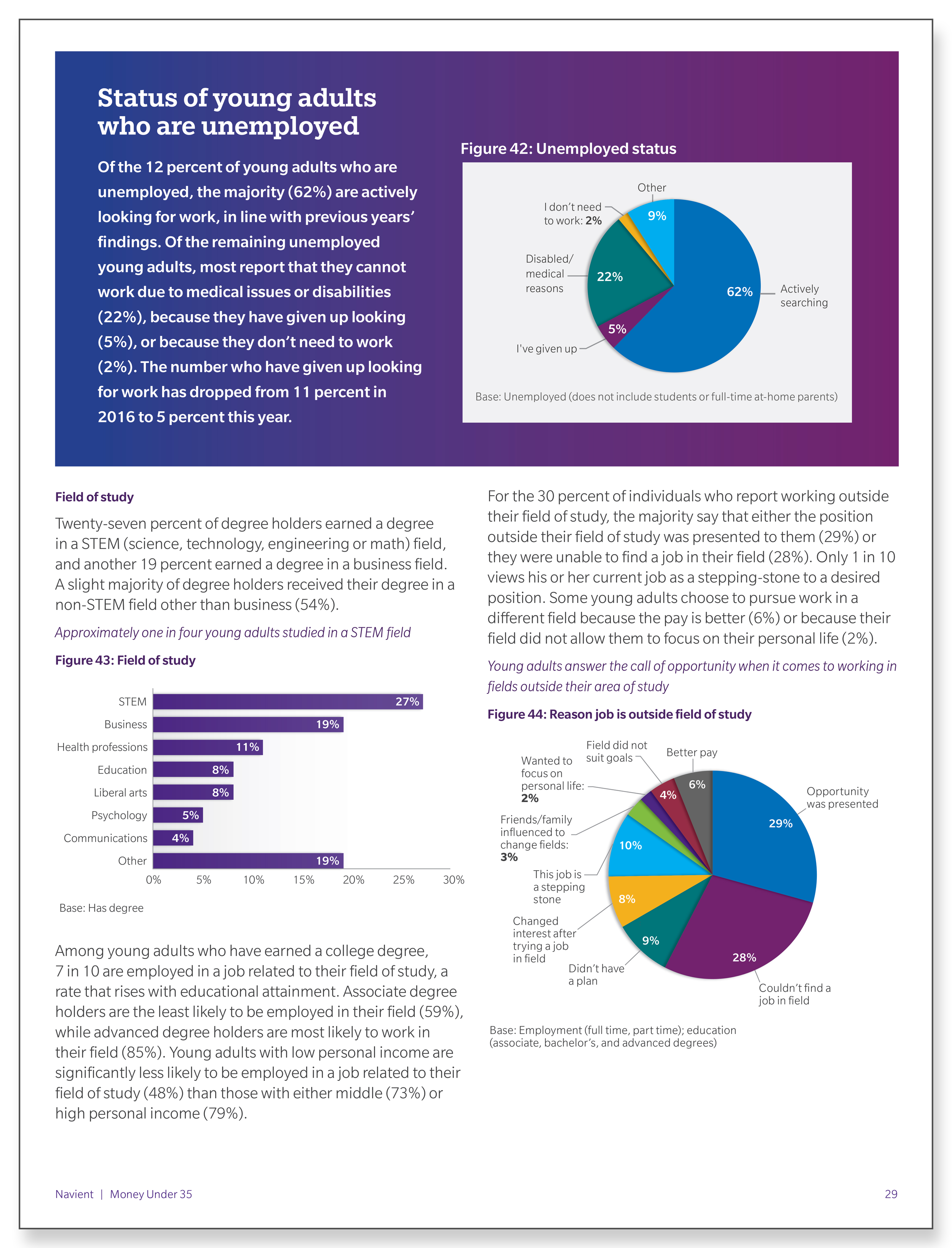
A thumbnail graphic displaying the graphic design and page layout example from the Money Under 35 report with infographic on the status of young adults who are unemployed.
A screenshot of the an infographic designed by Todd Rawley that was post on CNBC Make It Twitter account. The infographic post highlights statistics on Americans' retirement savings.
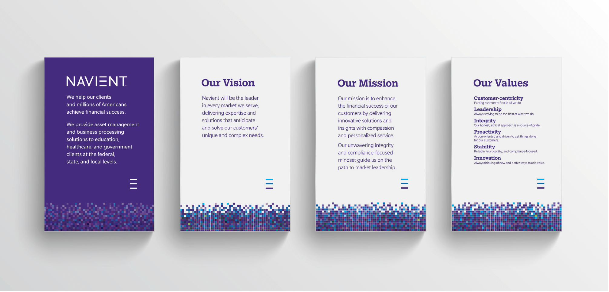
A graphic displaying the design and layout of banners displaying brand corporate description, vision, mission, and values.
A graphic displaying the design and layout schematic for a large wall installation featuring corporate brand mission, vision and values

Shortly after I joined the Marketing and Creative team, a growing consensus that the existing design system felt too conservative and limiting, prompting us to explore ways to evolve and expand it.

We recognized an opportunity to add value by adding and enhancing the guidelines with additional brand elements and modifying the characteristics of others.

The visual brand aesthetic was humanized by several factors: a new font, Egyptian Slate, was combined with the sans serif, Slate, brand font to broaden the stylistic character of typographic options available; The color palette was revised to create a sense of diversity, warmth, and friendliness; photography standards were revised to be less posed, more candid figure settings displayed in warmly cast light, and a new mosaic graphic element was introduced to reflect the expansion and diversity of our brand’s lines of business the multifaceted nature of our business.

CURRENT STATE OF BRAND • 2018 - Present

NEW Brand elements

Design layout featuring color blocks, cyan fade underline, triangular fades, and a callout box with placeholder text. Includes text headings and a photo of a group of people walking. Cyan color gradient and black triangular fades are displayed.

In 2020, Navient engaged with an outside branding agency to refresh the design system of the brand. I was fortunate, as a senior designer, to take part in meaningful conversation and be given influence over the decision making process that would help the organization update their new look.

A comprehensive design system was developed in coordination with a website update. This new system marked the first time a completely consistent look and feel was achieved across all collateral and mediums. I would be responsible for translating that new system across all brand collateral and developing a single-source guide that would help our creative team execute on the system consistently, effectively and efficiently.

A sample layout from the visual brand guide that Todd Rawley designed. The sample of the guide shows design standards set for Callouts, Buttons, and Footers.

A look of sophistication was achieved with the prominent use of gradient bands, bold color blocks, subtle use of underlines and shadow and a new brand font, New Hero that was implemented across print and web.

Brand guidelines

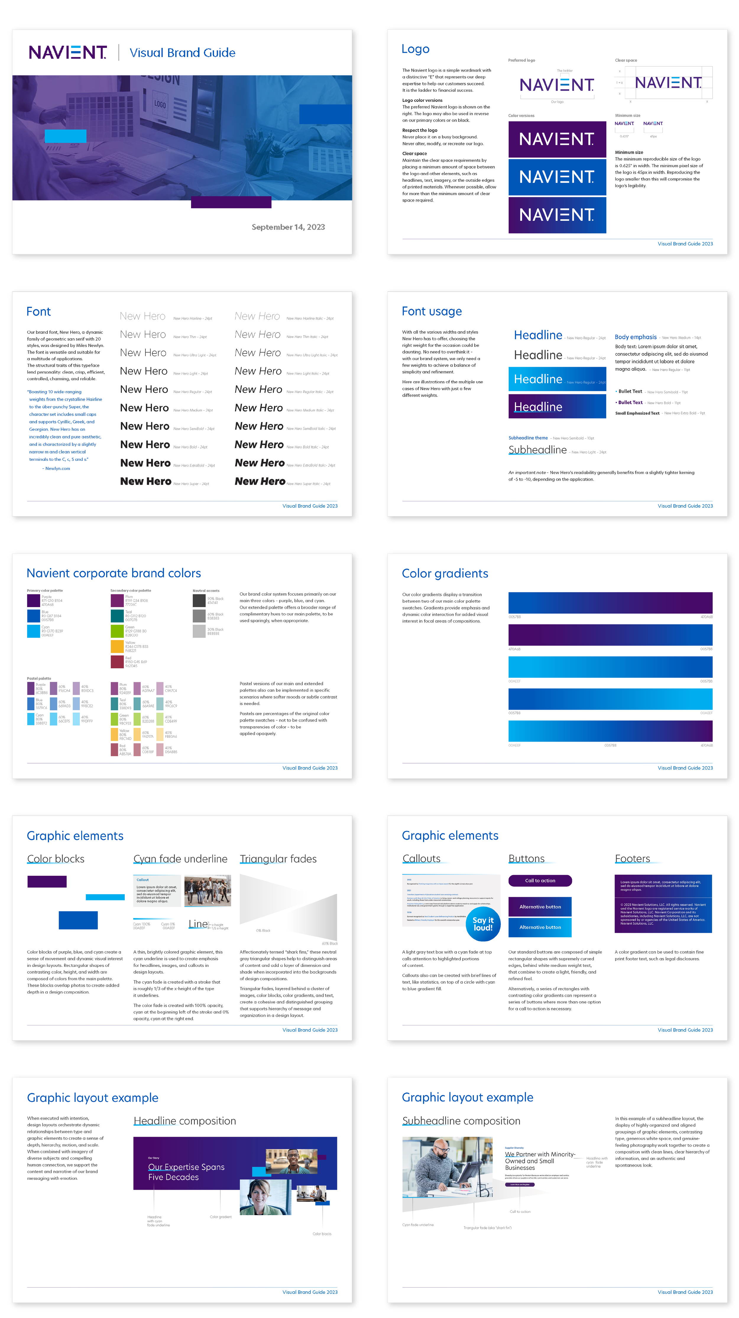
Todd Rawley's design of a visual brand guide showcasing logo usage, font types, color palettes, gradients, graphic elements, and layout examples. Includes instructions on corporate branding elements and visual style consistency.
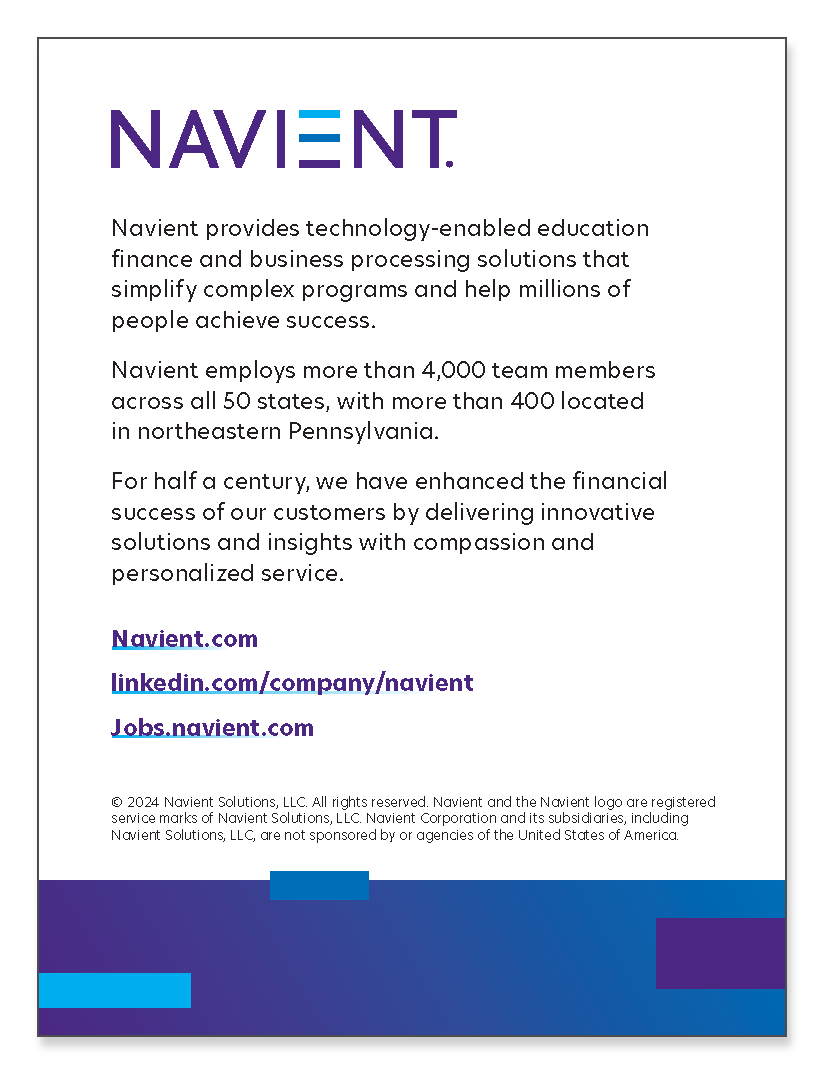
Page layout wuth company description and contact information including website and LinkedIn links.

Brand collateral

Todd's design and layout of the Navient Proxy Statement cover with images of a student, a graduation ceremony, and a business meeting, featuring company logo and meeting details
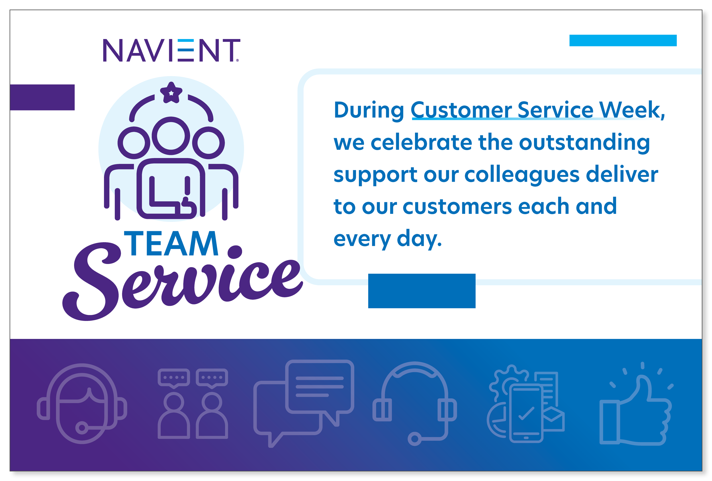
Graphic for Navient's Customer Service Week, featuring the words "Team Service" and symbols representing customer support and communication.
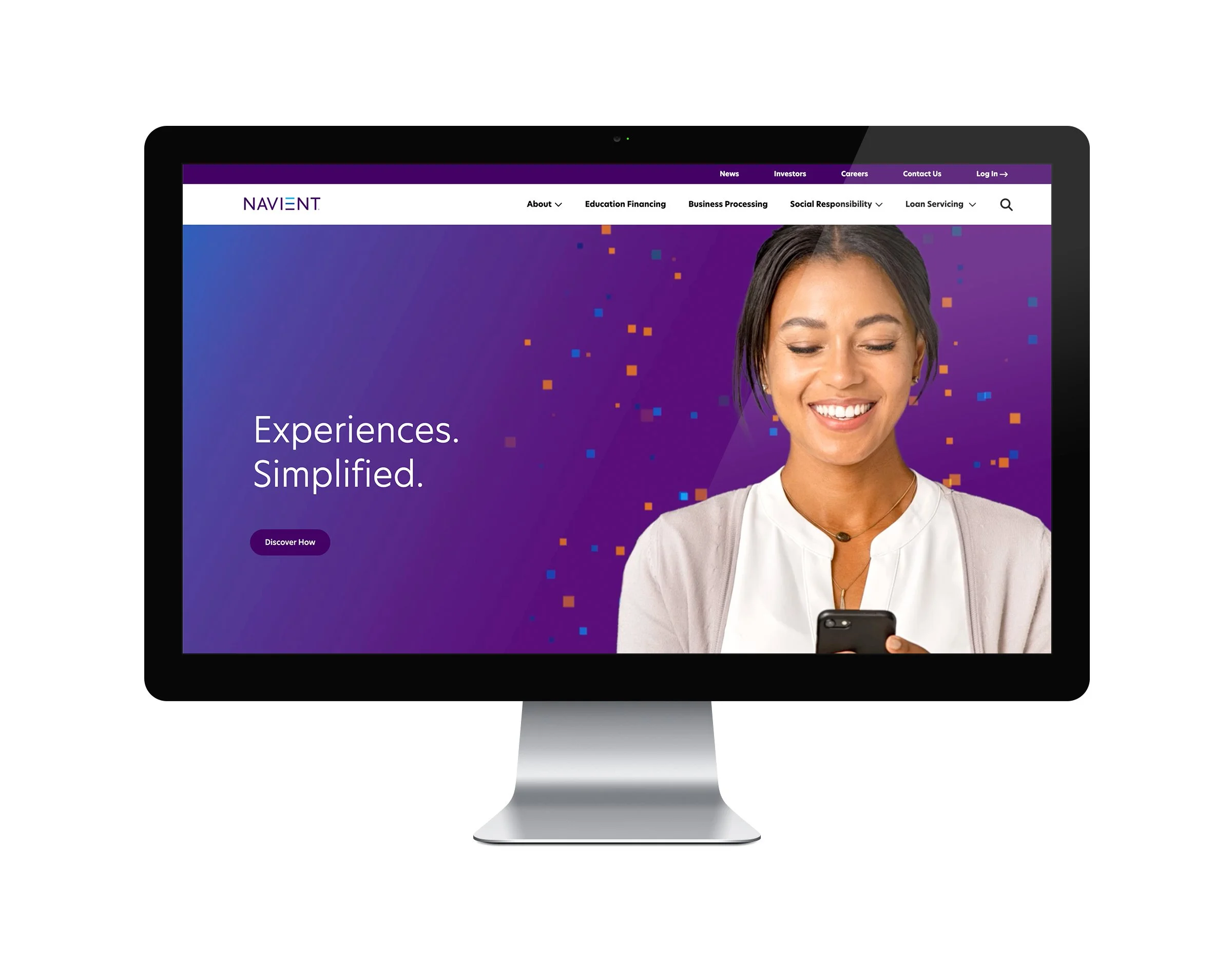
A mock-up of the Navient website homepage including an "above-the-fold" hero image with a smiling woman holding a smartphone on a purple gradient background.
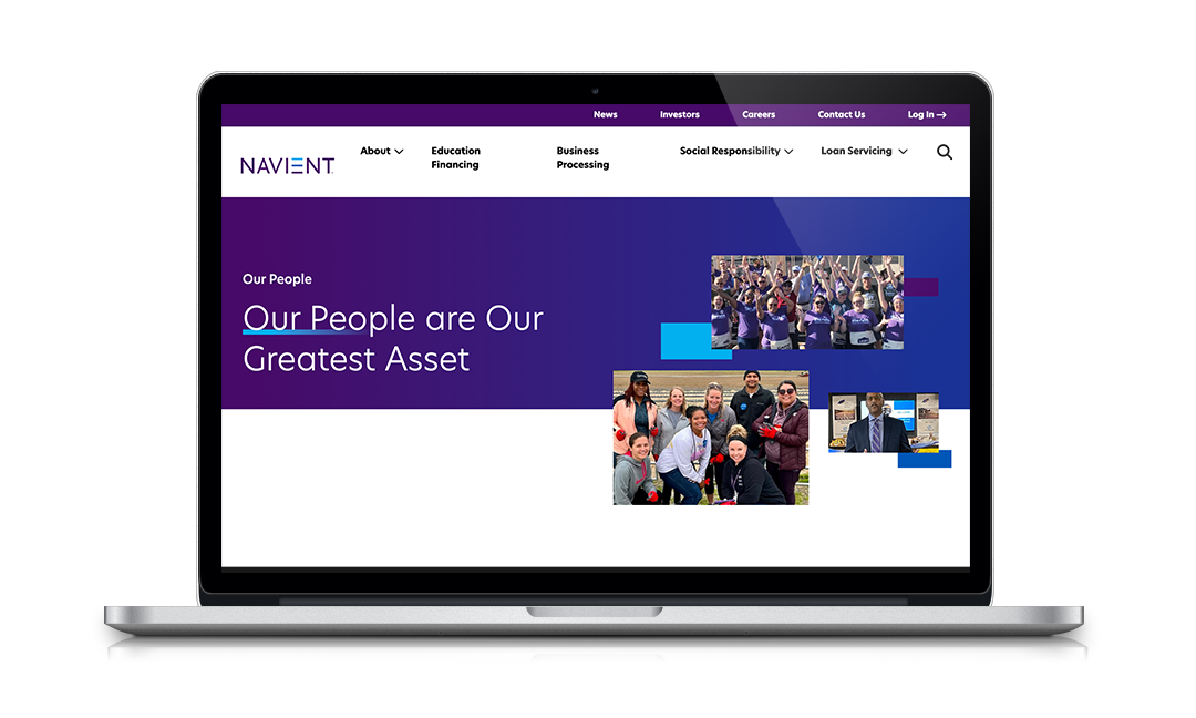
A mock up of the corporate website featuring photo selections and other graphic elements that Todd Rawley selected for the site.